
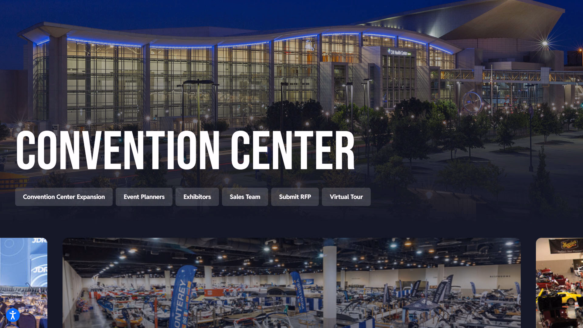
The Metropolitan Entertainment & Convention Authority (MECA) is a 501(c)(3) non-profit organization that builds and manages public event venues in Omaha, Nebraska.
MECA, managers of the CHI Health Center, came to JM Online with an outdated website that lacked functionality. We designed and developed a new website for CHI Center that's graphics/image-focused with unique layouts and minimal text. This project focused on the following top 3 priorities:
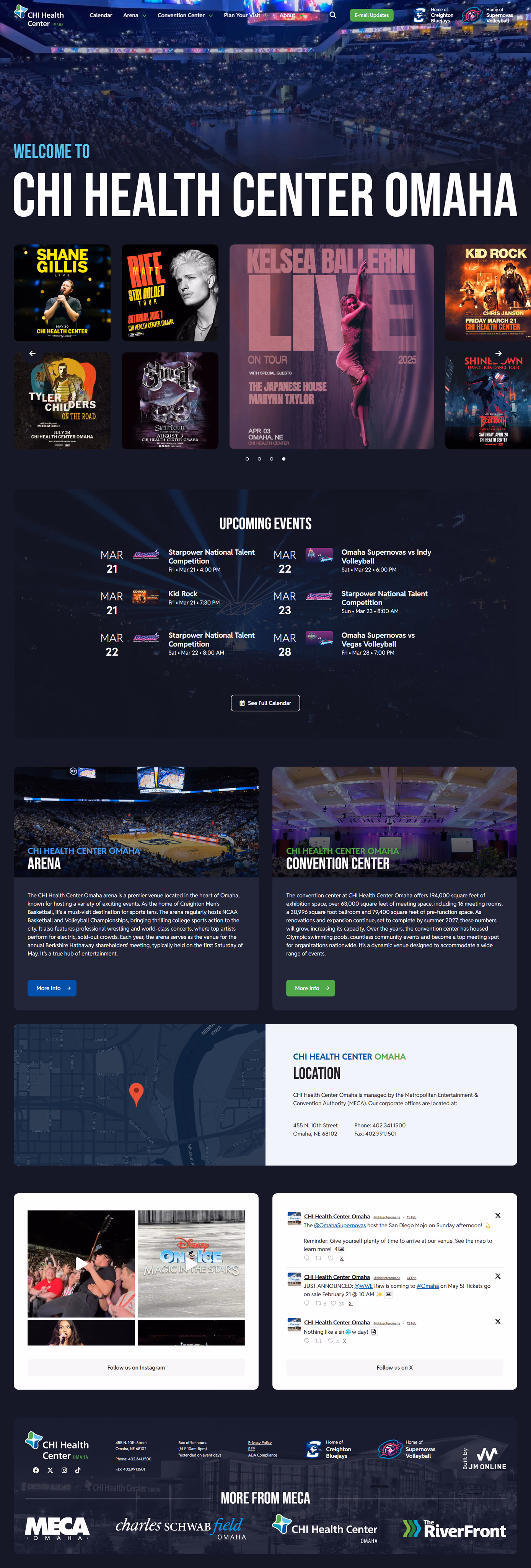
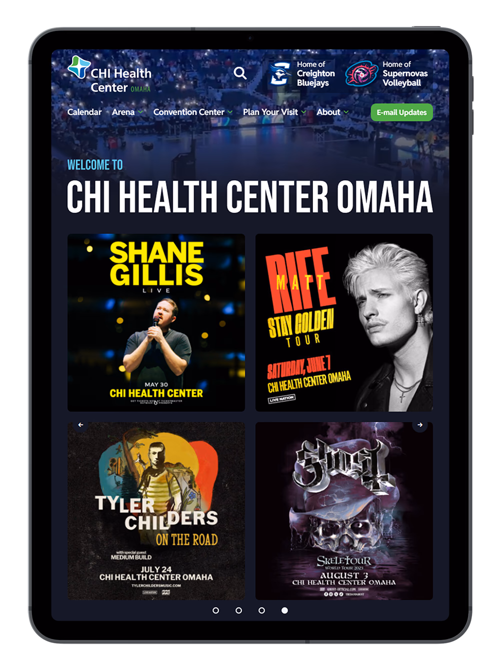
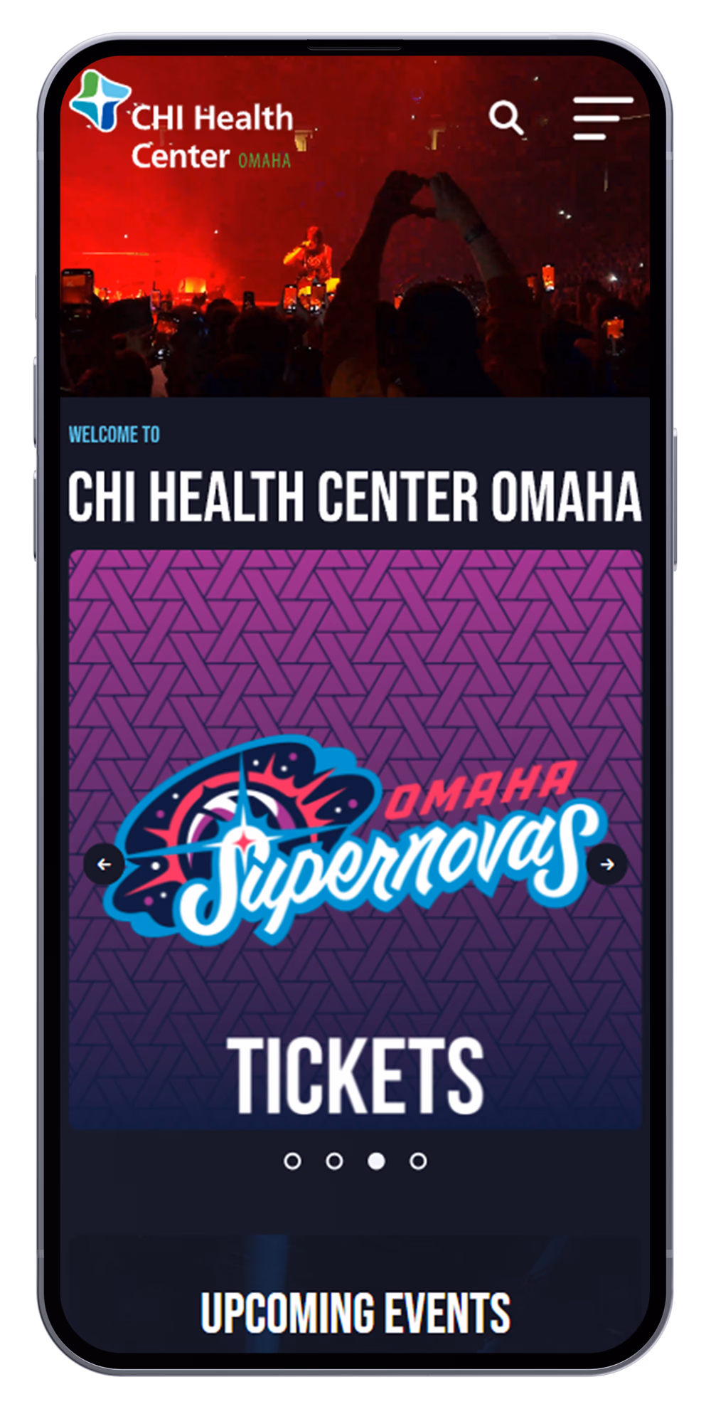
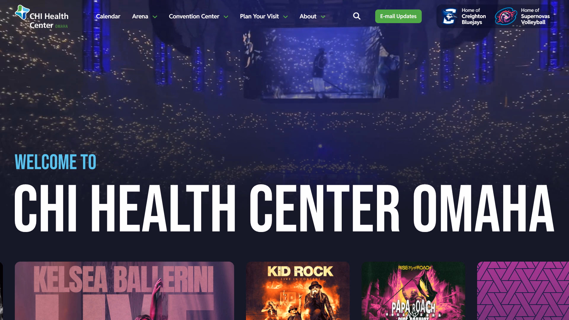
For a website with such a large volume of mobile visitors, it’s critical the user experience is as easy and frictionless as possible. We focused heavily on ensuring the design and development was catered towards visitors on the go.

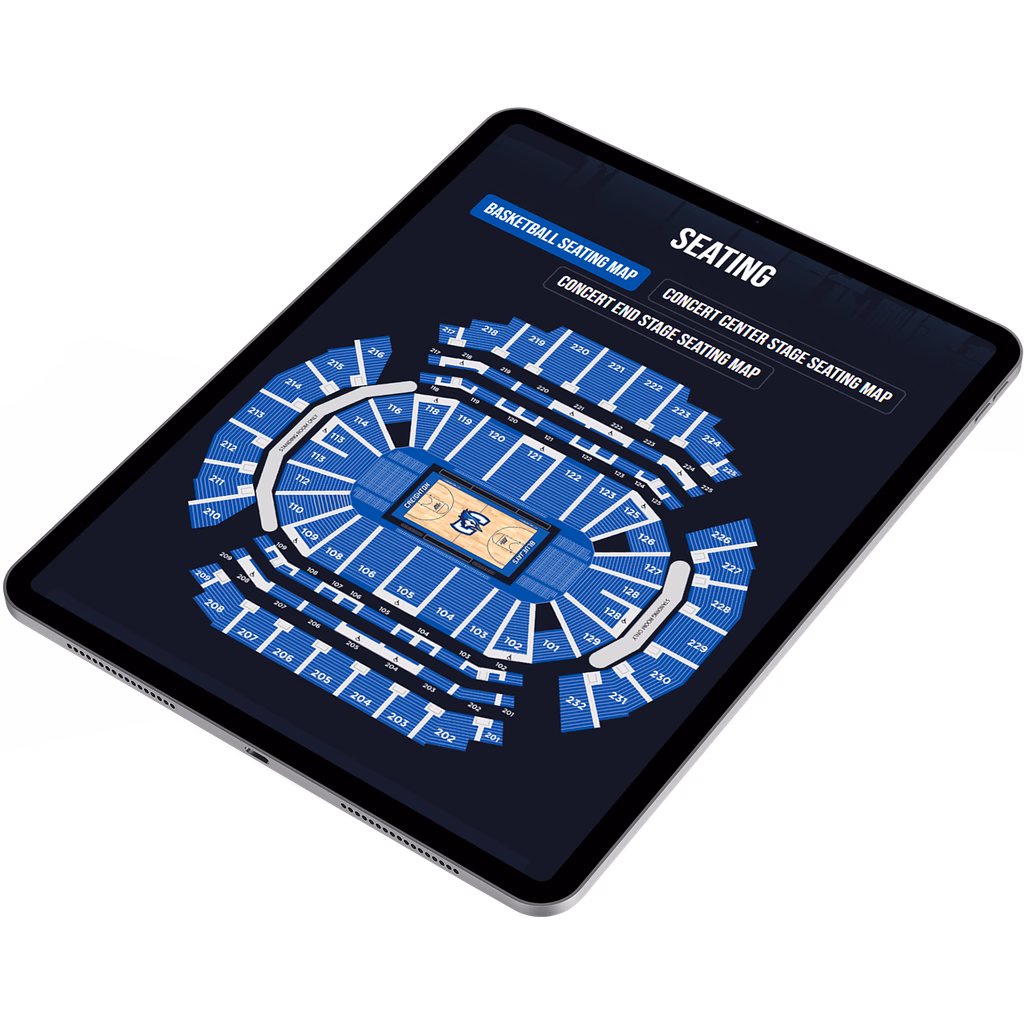
A desktop - and mobile-friendly interactive map for users to get familiar with each concourse level before or during their event.
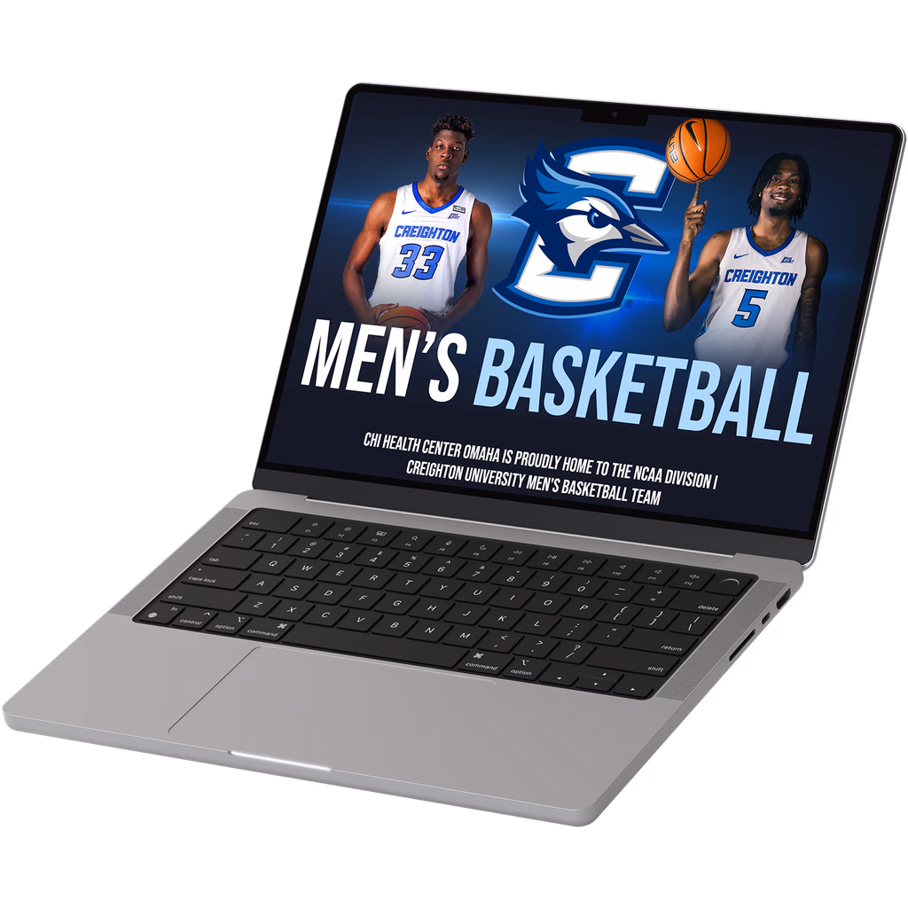
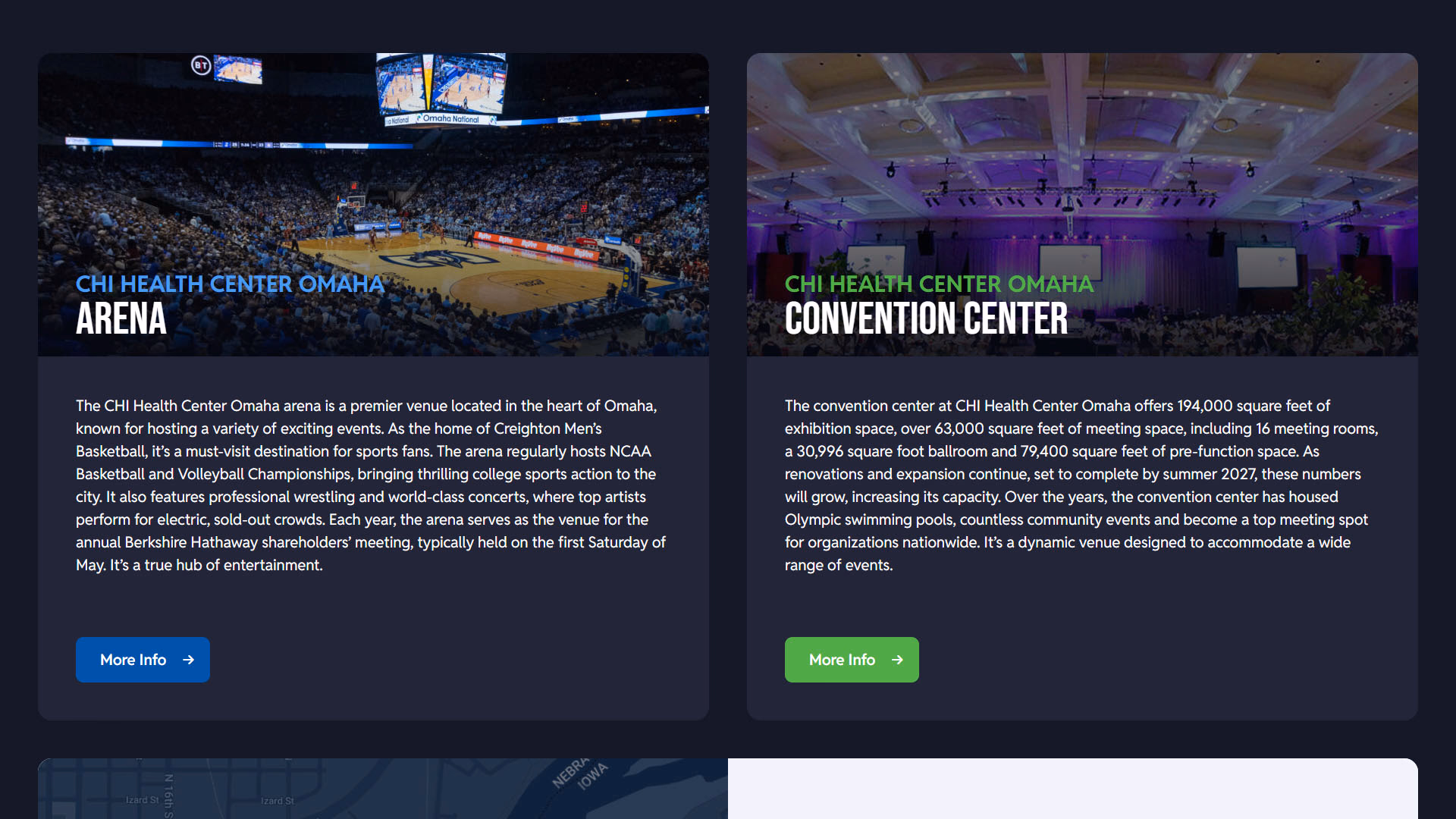
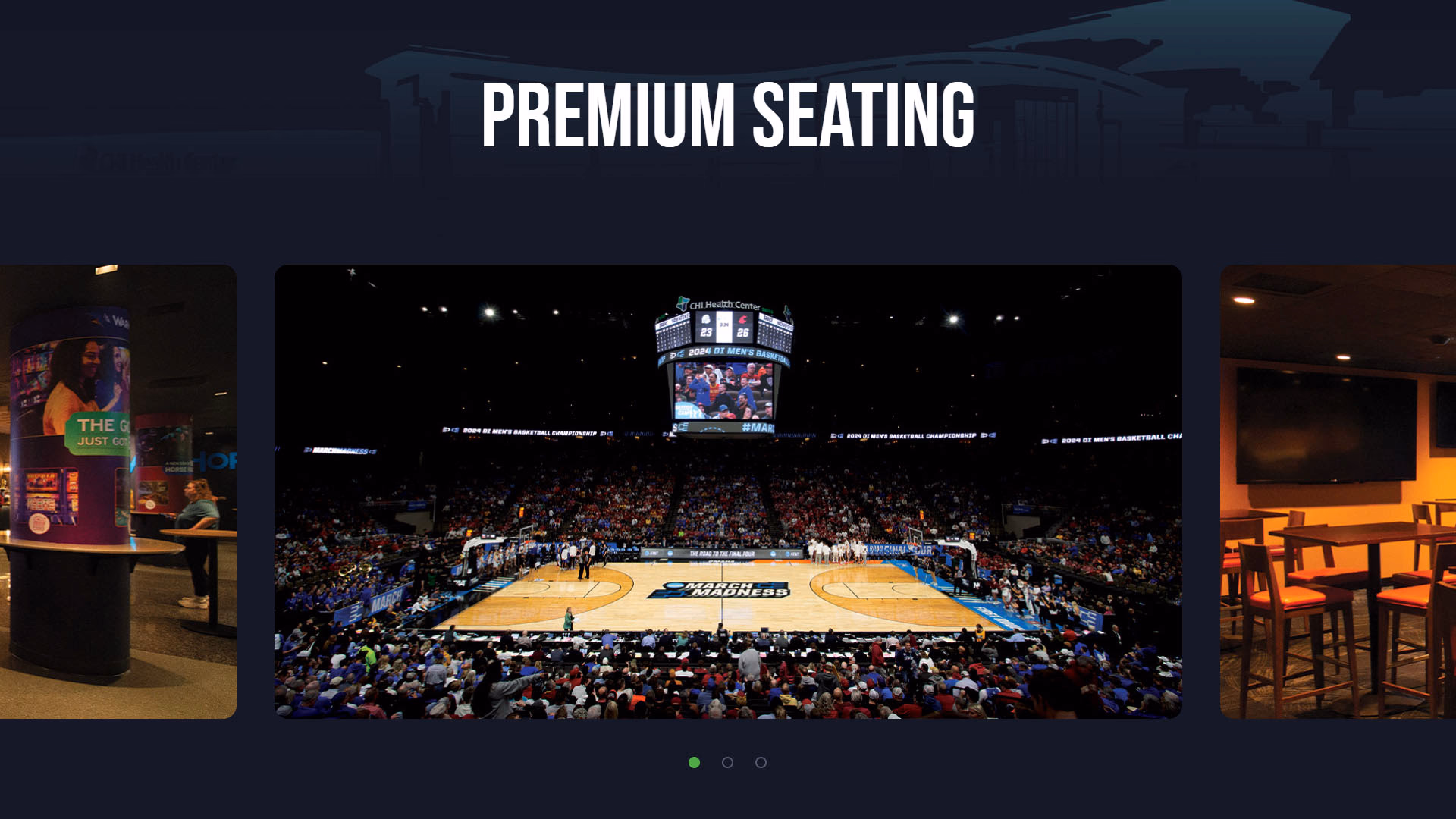
The CHI Health Center is so much more than the main arena. On the website, users can virtually walk in the front doors and navigate to find meeting rooms, ballrooms, exhibit halls, and much more.
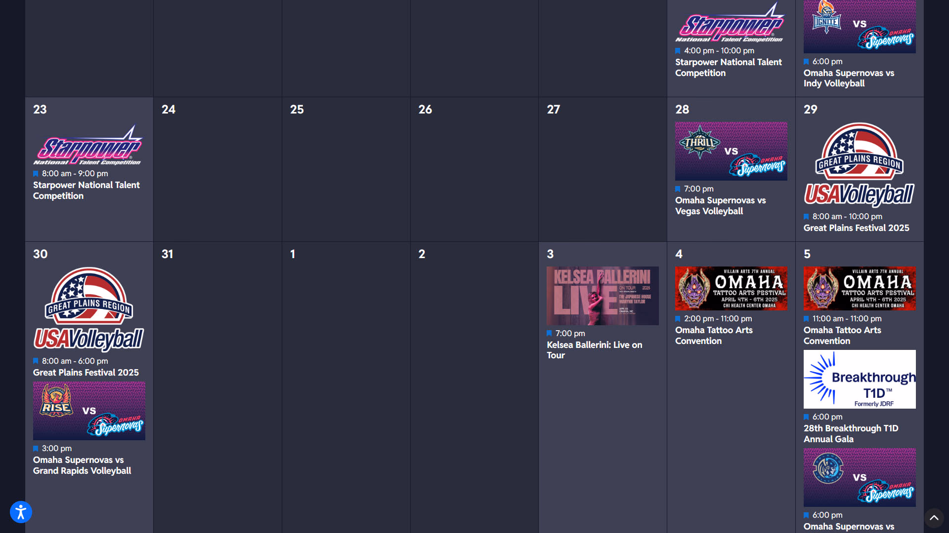
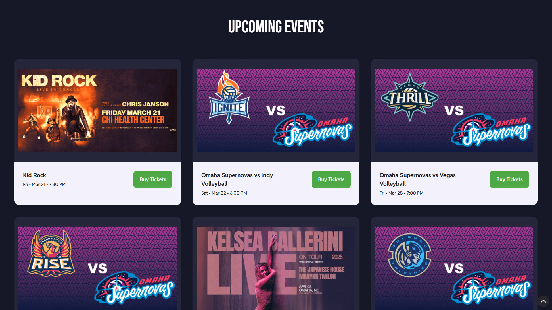
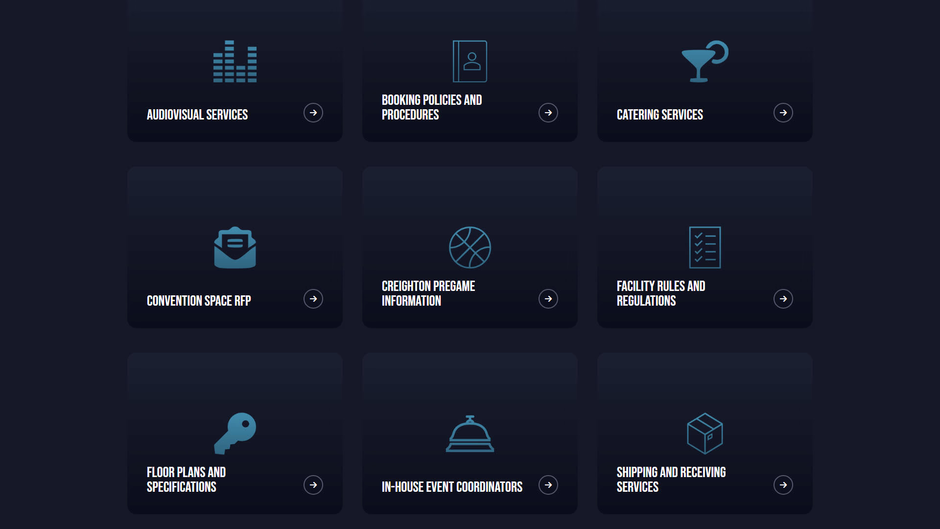
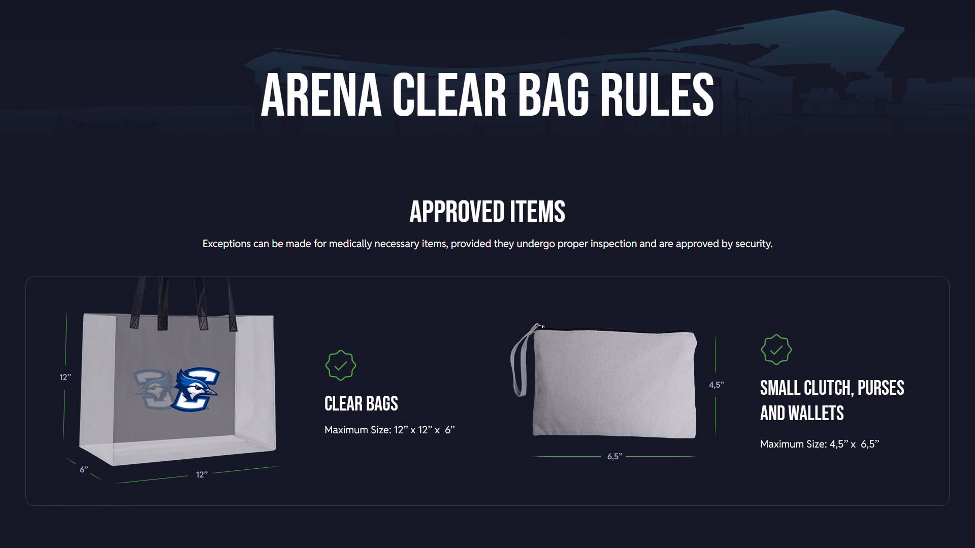
For an event center, accessibility is critical. Users can easily find all the information they need in one place.
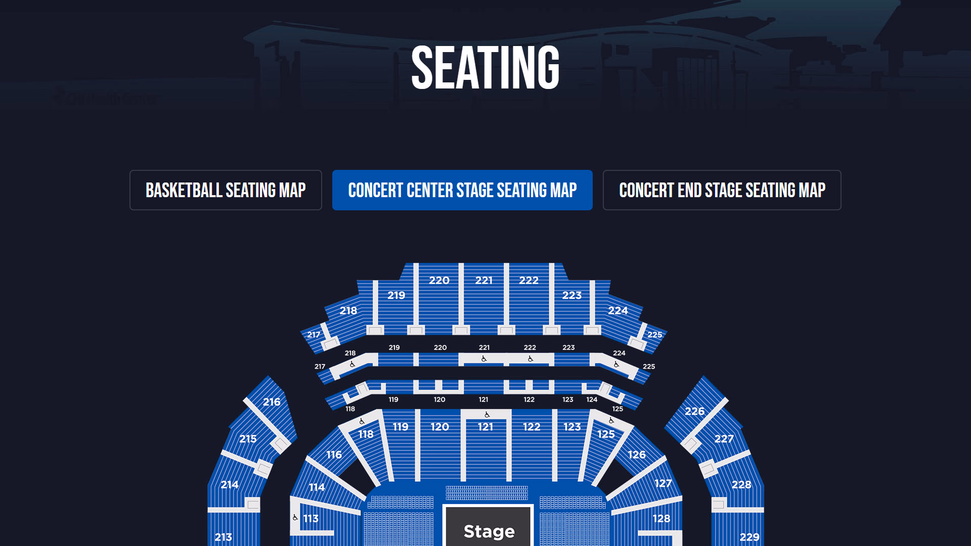
Whether it’s a basketball game or concert, users can get a visual birds-eye-view of how the arena is laid out.
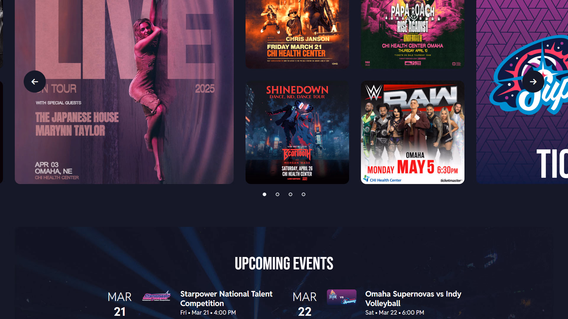
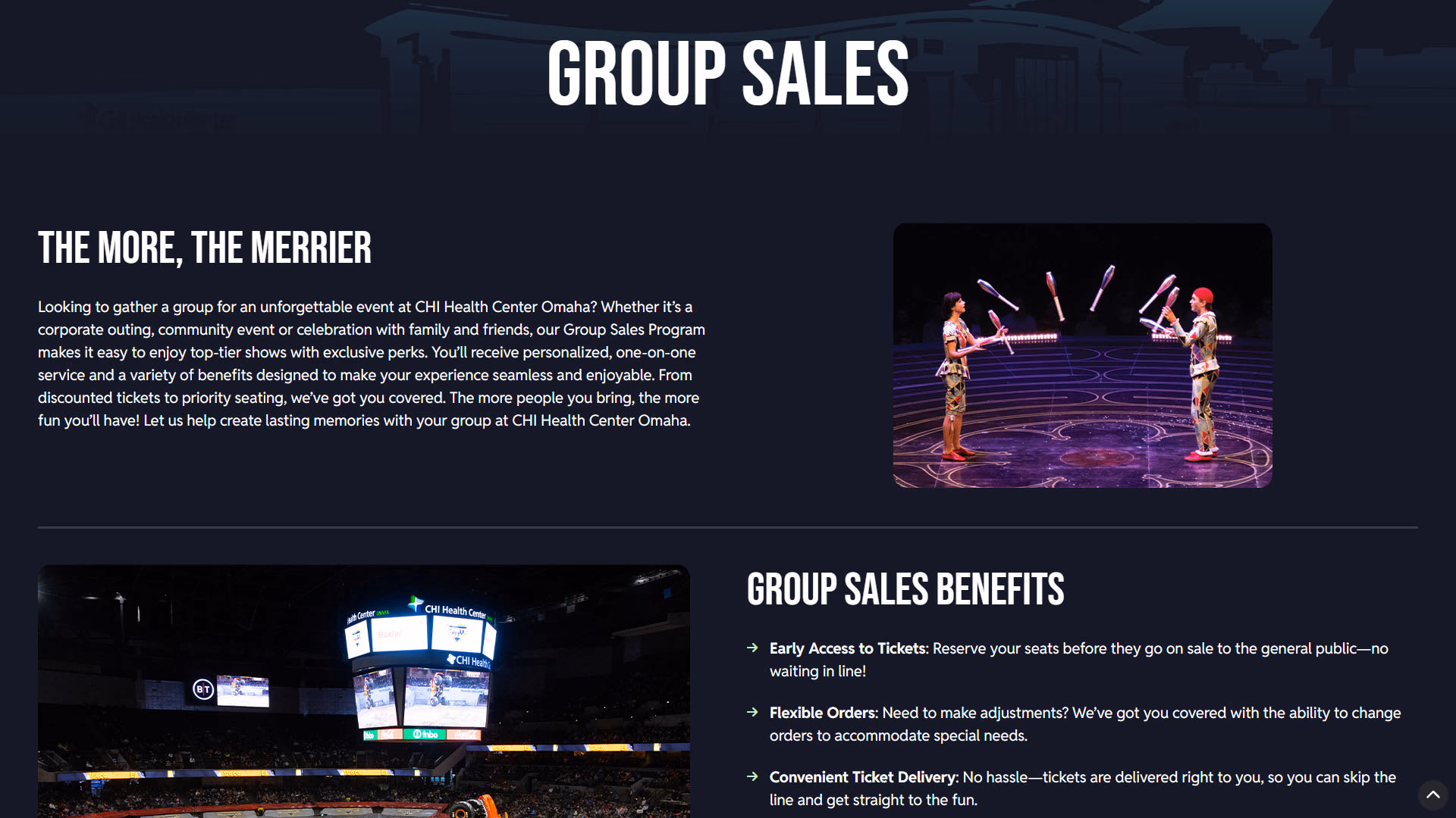
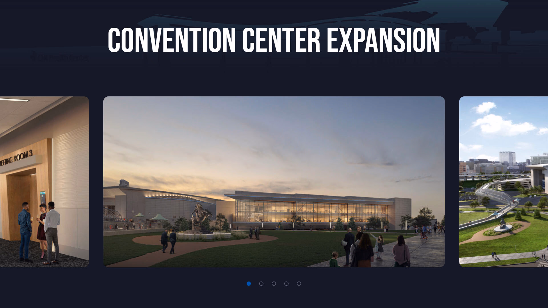
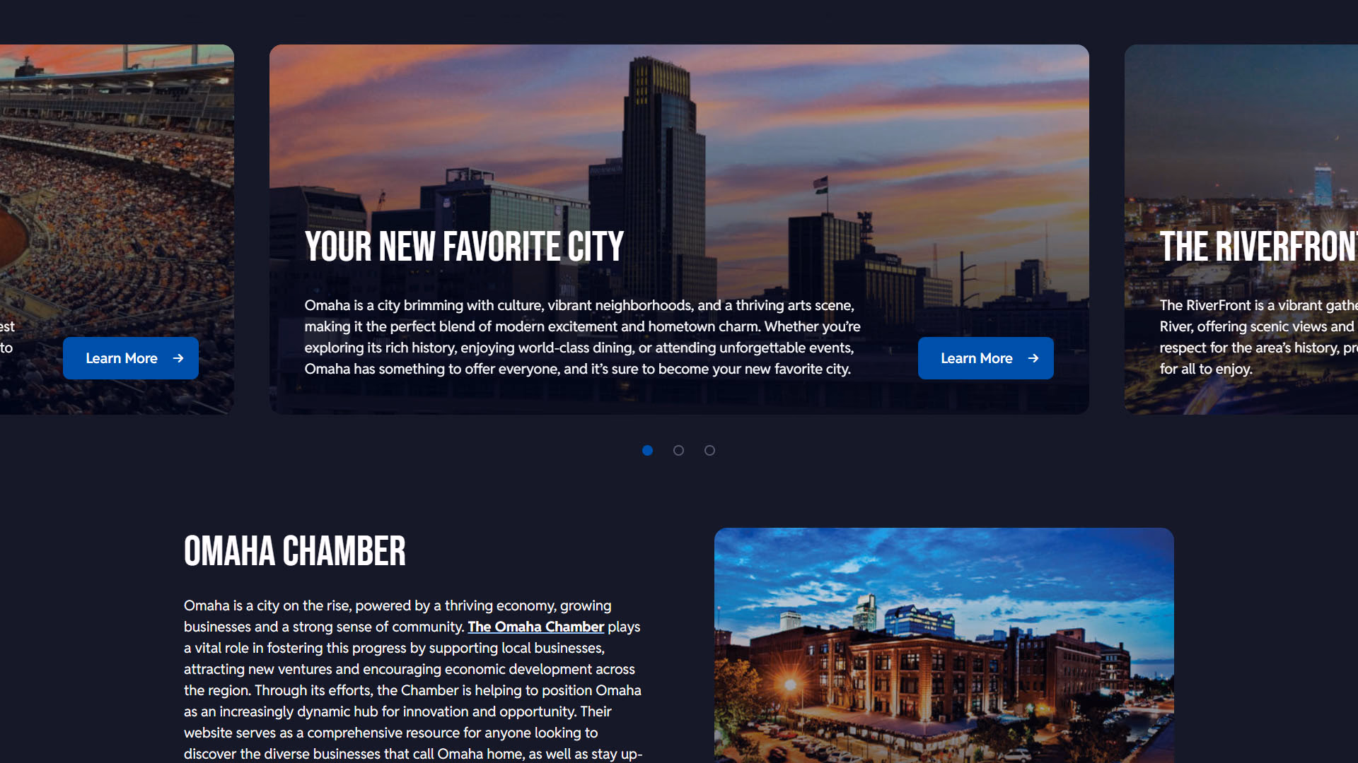
Websites that exclusively display their content in a repetitive layout can make the site start to feel dull. Throughout the website we occasionally switch things up to help keep the site alive.
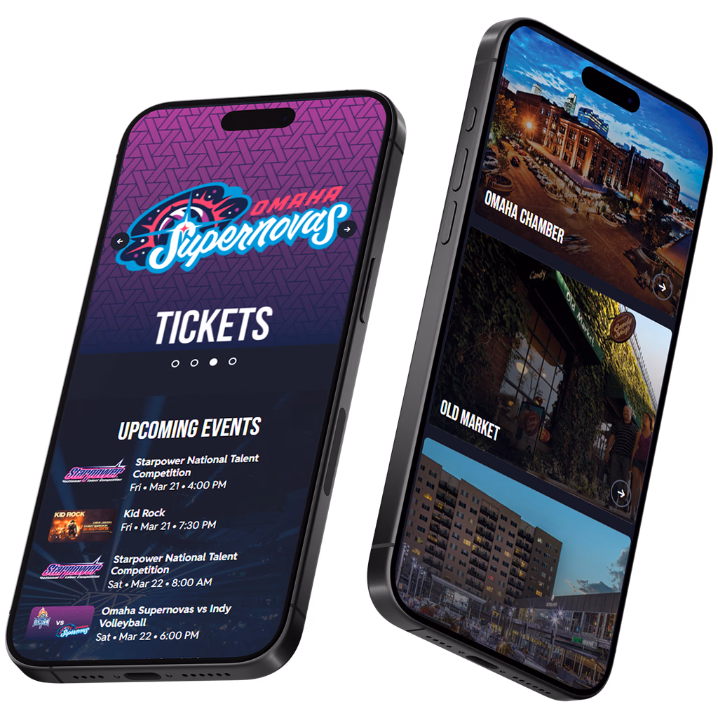
No need to create 2 entirely different pages. Through our custom development, we segmented two different categories of content so users can easily bounce back and forth without leaving the page.
We want you to love your website. Not only because it looks awesome, but because it’s a high-converting machine. Whether you have an RFP or are just browsing, we’re here.