Your homepage has a difficult job.
It needs to quickly explain what your business does, show visitors why they should trust you, help them find what they’re looking for, and encourage them to take the next step.
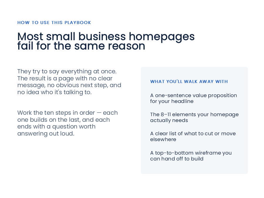
The problem is that many small businesses try to accomplish all of this by putting everything on their homepage.
Every service. Every team member. A long company history. An FAQ. Recent blog posts. Testimonials. Multiple calls-to-action. And sometimes several paragraphs explaining what the business does.
The result is a homepage that says a lot but communicates very little.
A better approach is to decide what your homepage actually needs to accomplish, then give each element a specific job.
Here’s a practical framework for deciding what belongs on your small business homepage.
1. Start With One Job
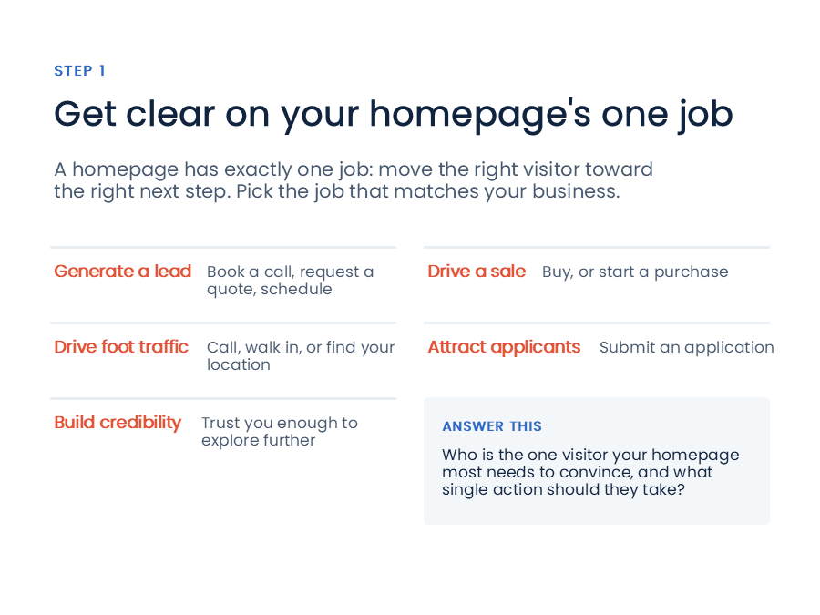
Your homepage has one primary job: move the right visitor toward the right next step.
That next step will vary depending on your business.
For example, your homepage might be designed to:
- Generate a lead by getting someone to book a call, request a quote, or schedule an appointment
- Drive a sale by getting someone to purchase a product
- Drive foot traffic by getting someone to call, visit your location, or get directions
- Attract applicants by getting someone to apply for a position
- Build credibility by convincing someone to trust your business enough to explore further
The important thing is to pick one.
A homepage that tries to accomplish five different things usually doesn’t do any of them particularly well.
Start by asking:
Who is the one visitor your homepage most needs to convince, and what single action should you want them to take?
That answer should influence nearly every other decision you make about the page.
2. Identify Your Most Important Visitors
Your homepage may serve several different types of visitors.
You might have:
- Prospective customers
- Current customers looking for support
- Job seekers
- Partners
- Vendors
- Members of the media
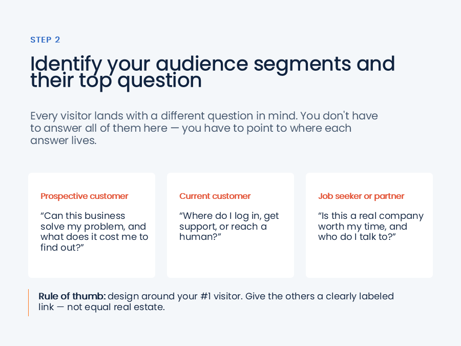
Each visitor arrives with a different question.
A prospective customer might be wondering, “Can this business solve my problem?”
A current customer might be wondering, “Where do I get support?”
A job seeker might be wondering, “Is this a company I’d want to work for?”
You don’t need to answer every question directly on the homepage.
Instead, make sure each important audience has a clear path to the information they’re looking for.
Most importantly, design the homepage around your #1 visitor.
Give everyone else a clearly labeled path through your navigation or a small supporting section rather than giving every audience equal space.
If everyone is equally important, no one is.
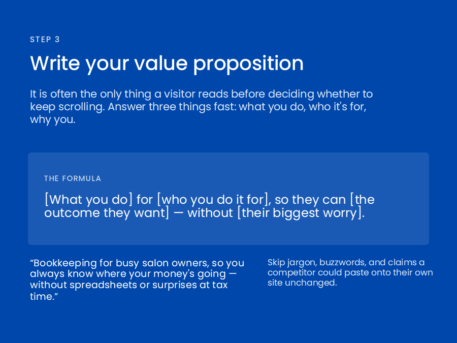
3. Make Your Value Proposition Obvious
The top of your homepage carries an enormous amount of responsibility.
In many cases, it’s the only part of the page a visitor reads before deciding whether to keep going.
Your headline and subheadline should quickly answer three questions:
- What do you do?
- Who is it for?
- Why should someone choose you?
A useful starting formula is:
[What you do] for [who you do it for], so they can [the outcome they want] — without [their biggest worry].
For example:
Bookkeeping for busy salon owners, so you always know where your money’s going — without spreadsheets or surprises at tax time.
The exact formula isn’t important. The clarity is.
Avoid industry jargon, internal terminology, and vague claims like “quality service you can trust.”
Your headline should be specific enough that a competitor couldn’t simply copy and paste it onto their own website.
4. Include the Elements Visitors Actually Need
Once you’ve established your homepage’s job, audience, and value proposition, you can determine what elements belong on the page.
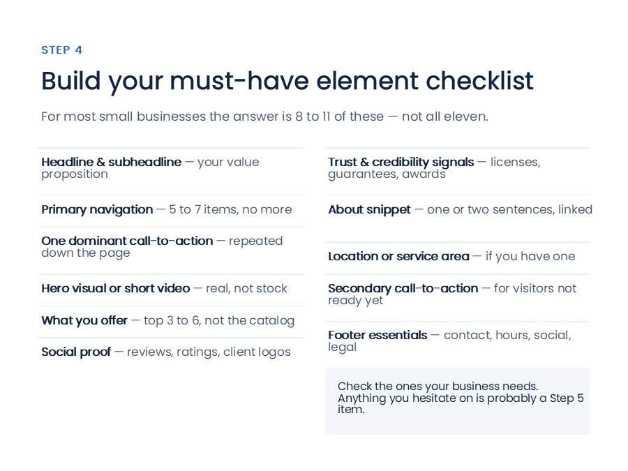
For most small businesses, you don’t need dozens of sections.
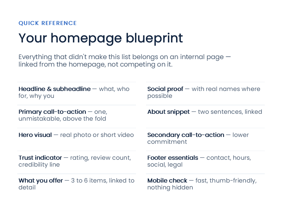
You typically need somewhere around 8–11 core elements, including:
Headline and subheadline
Clearly communicate what you do, who you do it for, and why you’re different.
Primary navigation
Give visitors clear paths to the most important parts of your website. For most businesses, five to seven primary navigation items is plenty.
One dominant call-to-action
Choose the primary action you want visitors to take and make it unmistakable. Repeat it throughout the page rather than introducing a different primary action in every section.
Hero visual
Use a real photo, short video, or other supporting visual that helps visitors understand your business.
Whenever possible, use authentic imagery of your products, team, space, or work instead of generic stock photography.
What you offer
Give visitors a quick overview of your core services or products.
You don’t need to list everything. Highlight the three to six most important offerings and link to pages where visitors can learn more.
Social proof
Show visitors evidence that other people have chosen and been happy with your business.
This could include testimonials, reviews, ratings, or recognizable client logos.
Trust and credibility signals
Certifications, licenses, awards, guarantees, years in business, and other legitimate credentials can help reassure visitors who aren’t familiar with your business.
About snippet
Give visitors a brief introduction to who you are.
One or two sentences is usually enough, with a link to your full About page for anyone who wants to learn more.
Location or service area
If your business serves a defined geographic area or has a physical location, make that information easy to find.
Secondary call-to-action
Not every visitor is ready to take your primary action.
A lower-commitment option, such as signing up for a newsletter, downloading a guide, or requesting a consultation, can give those visitors another path forward.
Footer essentials
Your footer should make important information easy to find, including contact information, hours, social links, and relevant legal or policy links.
5. Decide What Doesn’t Belong
One of the most important homepage decisions isn’t what to add.
It’s what to leave out.
Every element on your homepage competes with every other element for attention. The more you try to cover, the harder it becomes for visitors to find what matters.
A simple rule can help:
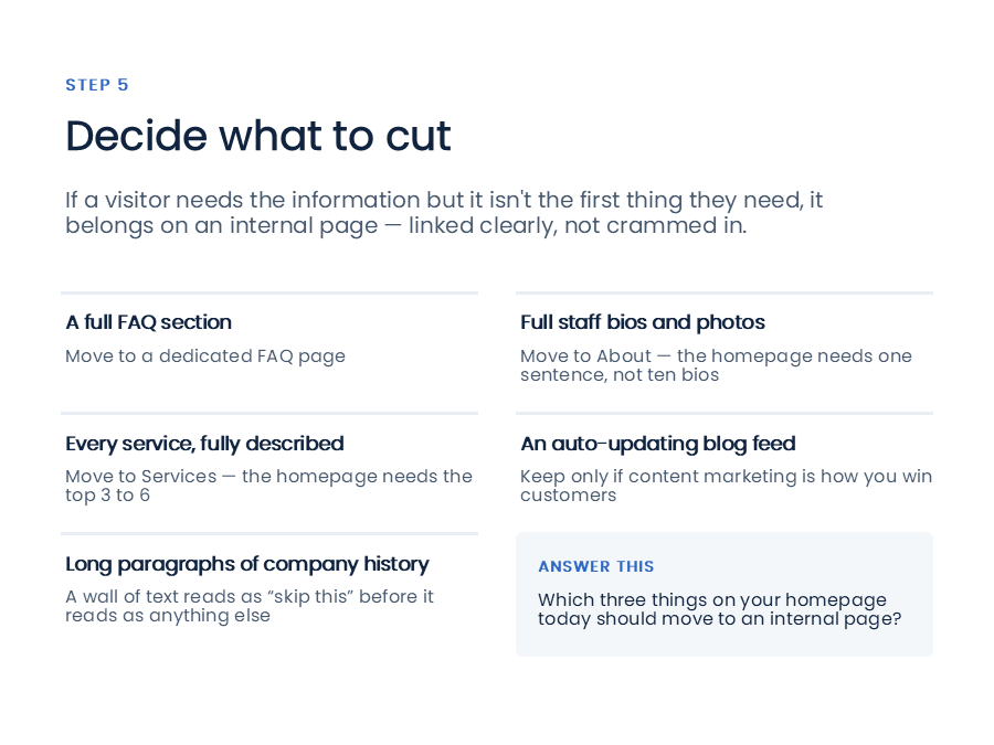
If a visitor needs the information, but it’s not the first thing they need, put it on an internal page.
For example:
A full FAQ
Put it on a dedicated FAQ page and link to it from the navigation or footer.
Full staff biographies
Put them on an About or Team page. Your homepage probably needs one sentence about your team, not ten individual biographies.
Every product or service
Put the complete catalog on your Services or Shop pages. Your homepage only needs to introduce the most important offerings.
An automatically updated blog feed
A blog feed doesn’t automatically make a homepage better. Keep it only if content marketing is a meaningful part of how your business attracts customers.
A long company history
Your visitors probably aren’t looking for a wall of text about your company’s history when they first arrive.
Give them the information they need to understand your business and decide what to do next. Save the deeper story for your About page.
The goal isn’t to hide information.
It’s to put the right information in the right place.
6. Prioritize What’s Above the Fold
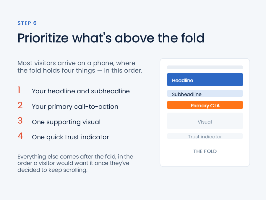
“Above the fold” refers to what a visitor can see before they scroll.
It’s some of the most valuable real estate on your website.
And because many visitors arrive on a phone, that space can be surprisingly small.
For most small business homepages, the area above the fold should focus on four things, in this order:
- Headline and subheadline
- Primary call-to-action
- One supporting visual
- One quick trust indicator
That’s it.
Your services, testimonials, About section, and secondary call-to-action can come later.
The visitor first needs to understand what you do, decide that it’s relevant to them, and know what to do next.
Then you can give them more information as they continue down the page.
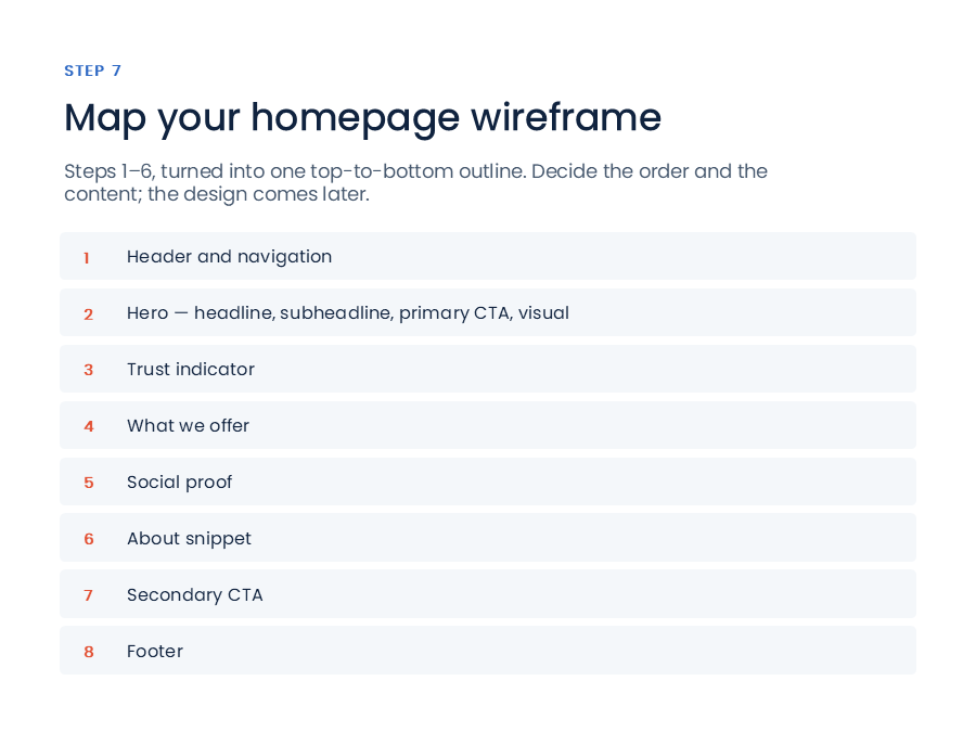
7. Put the Page in a Logical Order
Once you’ve decided what belongs on the homepage, put those elements into a simple top-to-bottom structure.
A useful starting point is:
- Header and navigation
- Hero with headline, subheadline, primary CTA, and visual
- Trust indicator
- What you offer
- Social proof
- About snippet
- Secondary CTA
- Footer
This doesn’t mean every business needs exactly this structure.
But it gives you a logical starting point for deciding what visitors should see first, second, and third.
Think of it as a blueprint rather than a finished design.
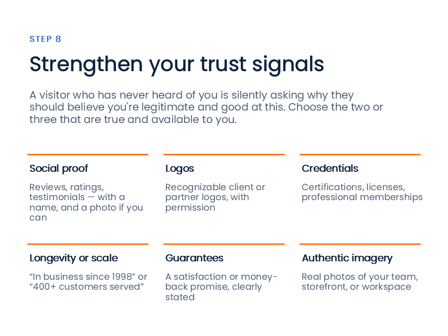
8. Use Trust Signals to Close the Credibility Gap
If someone has never heard of your business before, they’re asking a simple question:
Why should I believe this business is legitimate and good at what it does?
Trust signals help answer that question.
Choose two or three that are true and meaningful for your business.
These might include:
- Customer reviews and testimonials
- Star ratings
- Recognizable client or partner logos
- Certifications and licenses
- Professional memberships
- Years in business
- Number of customers served
- Guarantees
- Real photos of your team, storefront, or workspace
Authenticity matters here.
A real customer testimonial is more useful than a generic claim that you’re “committed to excellence.”
A real photo of your team is more useful than a generic stock photo of smiling businesspeople.
Your homepage doesn’t need to prove everything.
It just needs to give visitors enough evidence to feel comfortable taking the next step.
9. Make Sure It Works on Mobile
A homepage that looks great on a laptop can still be a poor homepage.
If the page is cramped, slow, difficult to navigate, or frustrating to use on a phone, you’re likely losing visitors before they even understand what you offer.
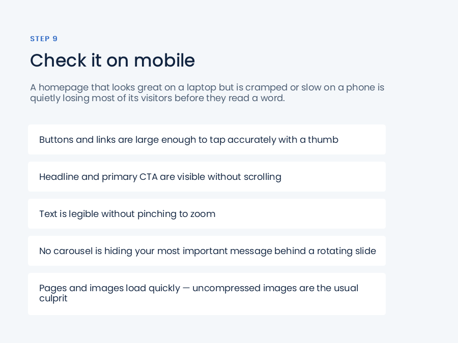
Check that:
- Buttons and links are easy to tap with a thumb
- Your headline and primary CTA are visible without scrolling
- Text is readable without zooming
- Your most important message isn’t hidden inside a rotating carousel
- Images and pages load quickly
Large, uncompressed images are a common cause of slow homepages, so pay particular attention to image file sizes.
Don’t treat mobile as a smaller version of your desktop website.
For many small businesses, it’s the primary version visitors will experience.
10. Test It With People Who Don’t Work There
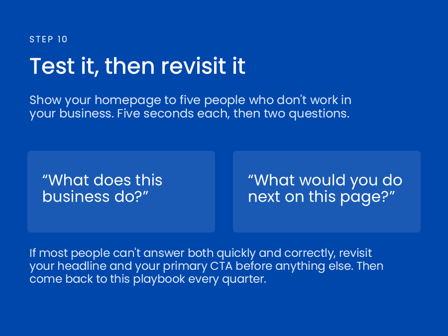
Before launching your new homepage, run a simple five-second test.
Show the homepage to five people who don’t work for your company.
Give each person five seconds.
Then ask:
“What does this business do?”
And:
“What would you do next on this page?”
That’s it.
You’re looking for clear, consistent answers.
If most people can’t answer both questions quickly and correctly, don’t immediately start changing colors, fonts, animations, or layouts.
Go back to the two things that matter most:
Your headline and your primary call-to-action.
Those are usually the first places to look when the page isn’t communicating clearly.
And don’t consider the homepage finished forever.
Revisit it periodically, especially when your offerings, audience, or messaging change. If you have analytics in place, pay attention to what visitors actually click and how far they scroll.
So, What Actually Belongs on Your Homepage?
A strong small business homepage generally needs:
- A clear headline and subheadline
- One primary call-to-action
- A supporting visual
- A trust indicator
- A simple overview of your core offerings
- Social proof
- A brief About section
- A secondary call-to-action
- Essential contact and business information
- A mobile-friendly experience
Everything else should earn its place.
The goal isn’t to make your homepage as comprehensive as possible.
It’s to make it as useful as possible to the right visitor.
Your homepage should tell visitors what they need to know, show them why they should believe you, and make the next step obvious.
Everything else can live somewhere else on your website.
Want a second opinion on your homepage?
Work through the ten steps, then bring us your blueprint. We’ll tell you what we’d build first. No proposal required.